My latest post is up over at the impeccable Mr. X’s site, and this time I’m talking all about Push Distortion!
Ghost in the Embroidery Machine – Distortion in Digitizing Part 2 – Push
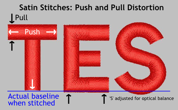
In the post, I not only cover why your letter ‘I’ gets taller and your letter ‘E’ threatens to crowd over into it’s neighbor (hint, Satin Stitches ‘push’ out at the ends during the machine embroidery process, kids!) but I take a brief detour into the proper way to text your designs for maximum quality.

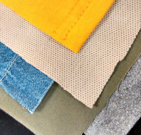
Machine embroidery works just a little differently on each of these- sample on stabilizer alone and you’ll never know.
Pair this with my previous post about ‘Pull’ distortion, and you can solve most of the basic problems with outlines not hitting their mark or shapes distorting when you embroider. I know, I’m crazy to give it all away, but shucks, I like you folks. I think you all have nice, honest faces. Besides, I don’t want to compete, I want us all to make the best embroidery we can. We have to show those knitting enthusiasts what we are made of, after all.


LEAVE A COMMENT